Click here to get instructions…
- Please download and unzip the replication files for Chapter 6 ( Chapter06.zip).
- Read
readme.htmland run6-0_ChapterSetup.R. This will create6-0_ChapterSetup.RDatain the sub folderdata/R. This file contains the data required to produce the table shown at the bottom of this page. - We also recommend to load the libraries listed in the Chapter 6’s
LoadInstallPackages.R
# assuming you are working within .Rproj environment
library(here)

# install (if necessary) and load other required packages
source(here("source", "LoadInstallPackages.R"))

# load environment generated in "6-0_ChapterSetup.R"
load(here("data", "R", "6-0_ChapterSetup.RData"))
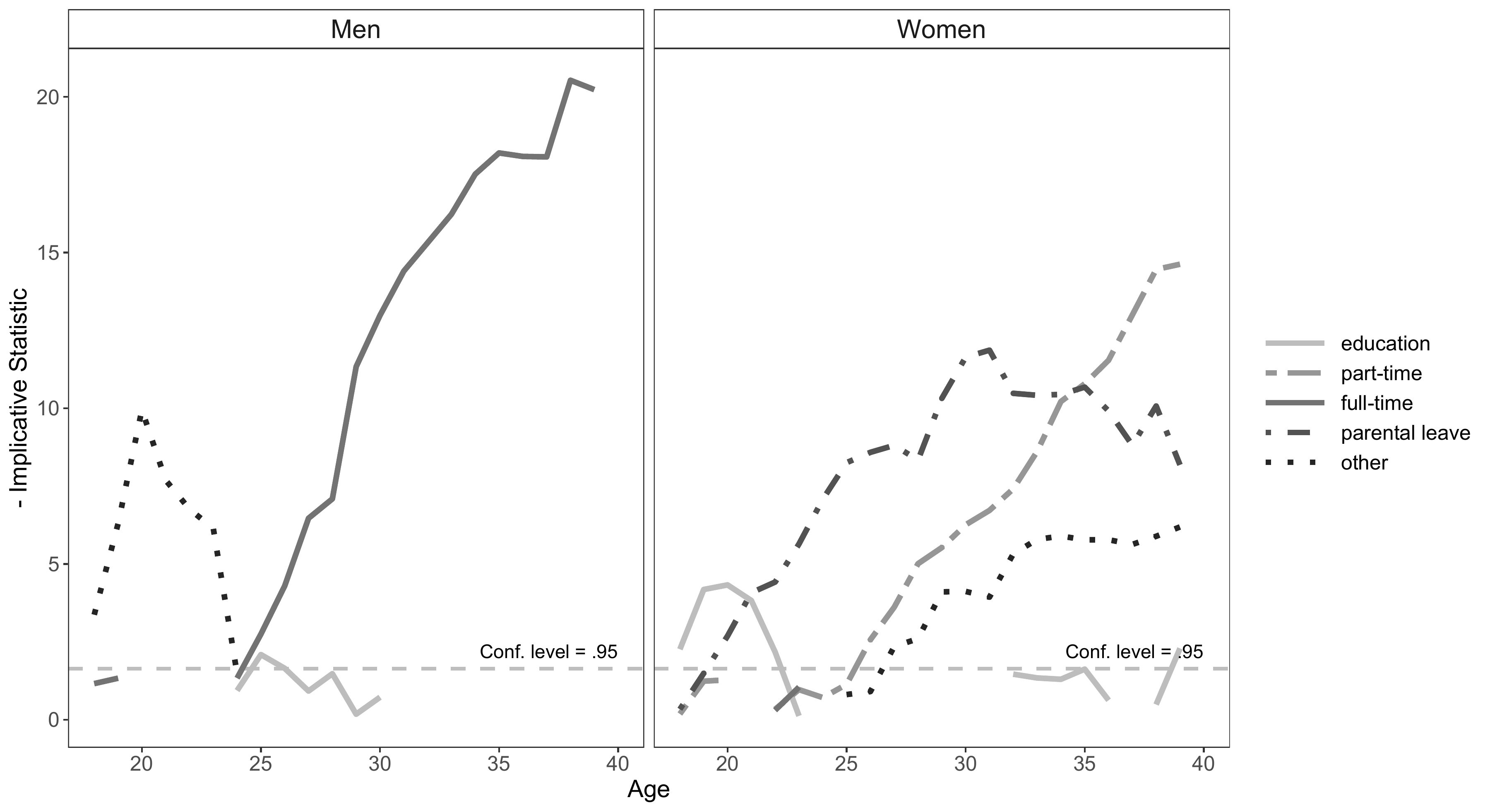
Figure 6.2 in Chapter 6.3 visualizes the typical states in the labor market sequences of men and women. This type of visualization is based on the implicative statistic framework which was introduced to the sequence analysis literature by Studer (studer2015?).
The figure is based on an analysis of labor market sequences with a
reduced alphabet distinguishing 5 instead of 8 states. We define the new
sequence object by recoding the original sequence object
activity.year.seq stored in
6-0_ChapterSetup.RData with {TraMineR}’s seqrecode
function. Note that you have to take care of the labels after you
defined a new sequence object with seqrecode.
# Inspect the original alphabet
alphabet(activity.year.seq)
[1] "EDU" "MIL/CS" "PT" "FT" "SELF" "PLEAVE"
[7] "MARGINAL" "UNEMP" # Recode alphabet
activity.year.seq2 <- seqrecode(activity.year.seq,
recodes = list("EDU" = "EDU",
"PT" = "PT",
"FT" = c("FT", "SELF"),
"PLEAVE" = "PLEAVE",
"OTHER" = c("MIL/CS","MARGINAL", "UNEMP")))
# Specify labels for new alphabet
attributes(activity.year.seq2)$labels <- c("education",
"part-time", "full-time",
"parental leave", "other")The position wise typical states are identified with the
seqimplic function from the {TraMineRextras} package. The function
requires a sequence object and a grouping indicator as an input. In our
example we use the labor market sequence object defined above
(activity.year.seq2) and gender (activity$sex)
as a grouping variable.
sex.implic <- seqimplic(activity.year.seq2,
                        group = activity$sex)
Even though the output seqimplic shows only a selection
of the 220 implication scores it contains (22 sequence positions (\(k=22\)) \(\times\) 5 states \(\times\) 2 groups), it is a little bit
overwhelming. We therefore turn to the visualization of the results
which can be obtained by:
plot(sex.implic, lwd=3)
Although, the initial figure is already very informative it requires
some adjustments to be considered publication-ready. Given our
restricted R skills and the fact that the appearance of the plot is
partly hard coded in seqimplic it is not straightforward to
revise the plot according to our wishes.
Hence, we turn to {ggplot2} for re-rendering the figure.
This requires to reshape the results stored in sex.implic.
The implication scores have to be stored in the long format with one row
for each combination of gender (Men vs. Women), sequence position (Age
18 to 39), and state (“EDU”, “PT”, “FT”, “PLEAVE”, “OTHER” ). The scores
are stored in a three-dimensional array sex.implic$indices
([1:2, 1:5, 1:22]). With {purrr}’s map function we
first extract the scores for men (sex.implic$indices[1, ,])
iterating 22 times over each of the five states and attaching the values
to each other rowwise (bind_rows()). We then repeat the
procedure for women. Both resulting objects are joined by
bind_rows.
To improve readability the plot displayed above shows the opposite
values of the implicative statistic. We re-built this behavior by
multiplying the values with \(-1\)
(mutate(value = value * -1)). The original plot does not
display negative values. Accordingly, we recoded negative values to
missings (mutate(value = ifelse(value < 0, NA, value)))
and only plot values >=0.
# Store men's implication scores in long format
men <- map(1:5, ~as_tibble(sex.implic$indices[1,.x,]) %>%
                mutate(state = sex.implic$labels[.x], .before = 1) %>%
                mutate(Age = row_number() + 17, .before = 1)) %>%
  bind_rows() %>%
  mutate(value = value * -1) %>%
  mutate(value = ifelse(value < 0, NA, value)) %>%
  mutate(state = factor(state, levels = sex.implic$labels)) %>%
  mutate(group = "Men", .before = 1)

# Store women's implication scores in long format
women <- map(1:5,~as_tibble(sex.implic$indices[2,.x,]) %>%
                mutate(state = sex.implic$labels[.x], .before = 1) %>%
                mutate(Age = row_number() + 17, .before = 1)) %>%
  bind_rows() %>%
  mutate(value = value * -1) %>%
  mutate(value = ifelse(value < 0, NA, value)) %>%
  mutate(state = factor(state, levels = sex.implic$labels)) %>%
  mutate(group = "Women", .before = 1)

# Join gender-specific files
sex.implic.long <- bind_rows(men, women)
As usual the code for producing the plot with ggplot is
quite verbose but also very easy to customize. We start with a colored
figure. The figure is much more appealing than the one we showed above
(but also required much more code).
sex.implic.long %>%
  ggplot(aes(x=Age, y=value, group=state)) +
  facet_wrap(~group) +
  geom_line(aes(color=state), size =1.5) +
  scale_color_manual(values = sex.implic$cpal) +
  geom_hline(yintercept=qnorm(.95),
             linetype="dashed", color = "grey",
             size =1) +
  annotate(geom="text", x=40, y= qnorm(.95) * 1.2,
           label="Conf. level = .95",
           color = "black", hjust = 1, vjust = 0) +
  ylab("- Implicative Statistic") +
  theme_bw() +
  theme(legend.key.width = unit(1.5,"cm"),
        panel.grid.major = element_blank(),
        panel.grid.minor = element_blank(),
        strip.background = element_rect(fill= "transparent"),
        legend.title = element_blank())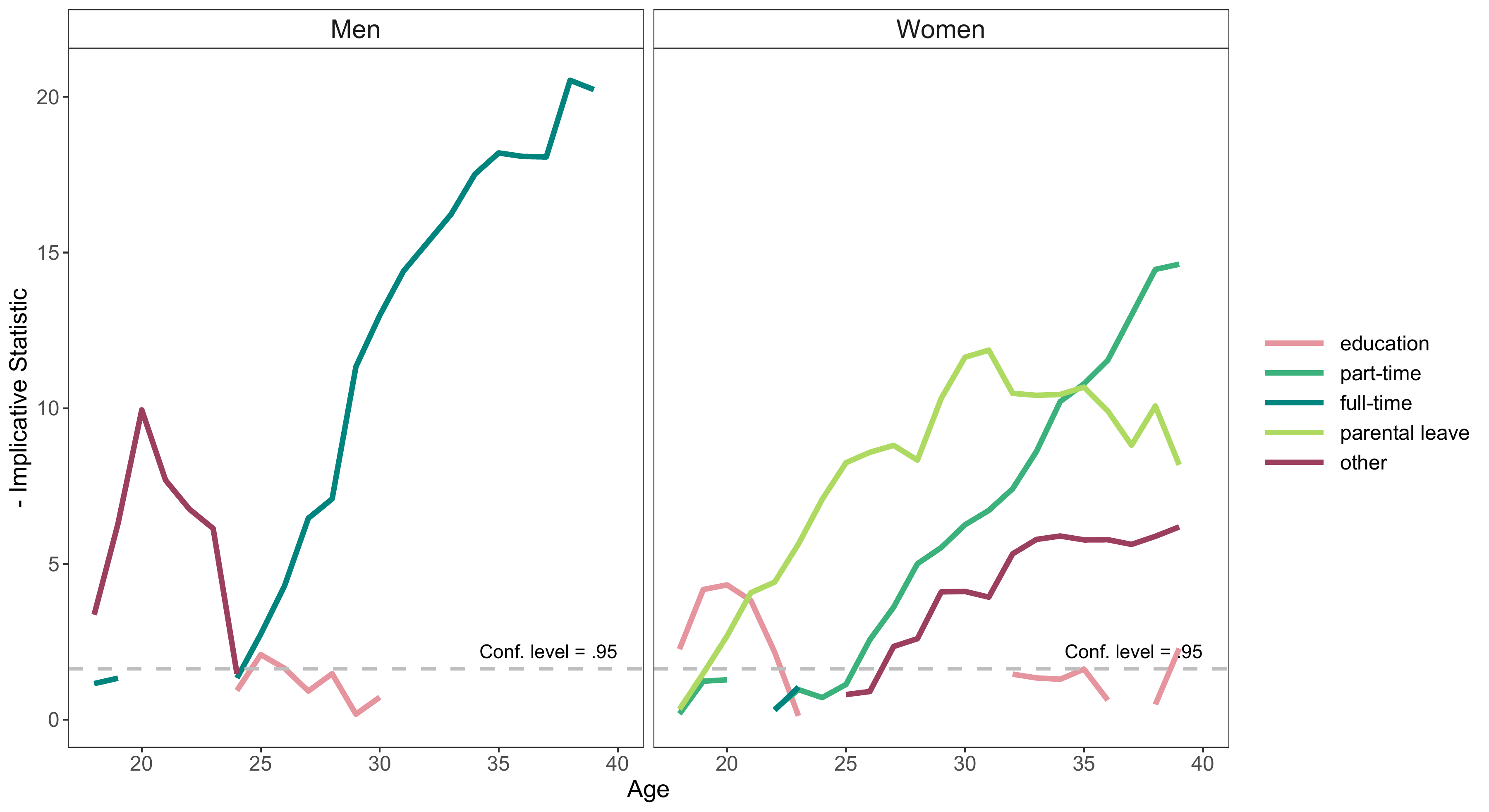
The following example illustrates how easily the code can be adjusted
to produce a grayscale version of the figure. We apply a gray “color”
palette
(scale_color_manual(values=brewer.pal(7, "Greys")[3:7]))
and different line types (linetype = state argument in
geom_line and scale_linetype_manual) to
distinguish the states of the alphabet.
ggplot(aes(x=Age, y=value, group=state)) +
  facet_wrap(~group) +
  geom_line(aes(color=state, linetype = state), size =1.5) +
  geom_hline(yintercept=qnorm(.95),
             linetype="dashed", color = "grey",
             size =1) +
  geom_line(aes(color=state, linetype = state), size =1.5) +
  scale_color_manual(values=brewer.pal(7, "Greys")[3:7]) +
  scale_linetype_manual(values=c("solid",
                                 "twodash",
                                 "solid",
                                 "dotdash",
                                 "dotted")) +
  annotate(geom="text", x=40, y= qnorm(.95) * 1.2,
           label="Conf. level = .95",
           color = "black", hjust = 1, vjust = 0) +
  ylab("- Implicative Statistic") +
  theme_bw() +
  theme(strip.text = element_text(size = 15),
        axis.title = element_text(size = 14),
        axis.text = element_text(size = 12),
        legend.key.width = unit(1.5,"cm"),
        legend.text = element_text(size = 12),
        panel.grid.major = element_blank(),
        panel.grid.minor = element_blank(),
        strip.background = element_rect(fill= "transparent"),
        legend.title = element_blank())