Click here to get instructions…
- Please download and unzip the replication files for Chapter 5 ( Chapter05.zip).
- Read
readme.htmland run5-0_ChapterSetup.R. This will create5-0_ChapterSetup.RDatain the sub folderdata/R. This file contains the data required to produce the plots shown below. - You also have to add the function
legend_large_boxto your environment in order to render the tweaked version of the legend described below. You find this file in thesourcefolder of the unzipped Chapter 5 archive. - We also recommend to load the libraries listed in Chapter 5’s
LoadInstallPackages.R
# assuming you are working within .Rproj environment
library(here)

# install (if necessary) and load other required packages
source(here("source", "load_libraries.R"))

# load environment generated in "5-0_ChapterSetup.R"
load(here("data", "R", "5-0_ChapterSetup.RData"))
In chapter 5.3, we introduce the so-called multichannel sequence
analysis. We are now using the data.frame
multidim, which contains both family formation and labor
market sequences. Note that individual 1 in one pool of sequences has to
correspond to individual 1 in the other pool of sequences. The data come
from a sub-sample of the German Family Panel - pairfam. For further
information on the study and on how to access the full scientific use
file see here.
The original companion page for Chapter 5.5 can be found here. This page only shows how to render
Figure 5-2 using ggseqplot::ggesqiplot instead of
TraMineR::seqIplot.
Computing dissimilarity matrix and extracting cluster variable
Here we re-use the code shown and commented on the tutorial page for Chapter 5.5. We compute the dissimilarity matrix, run a cluster analysis and generate a variable indicating the cluster membership for each of the persons in our data.
# Compute the joint dissimilarity matrix
mcdist.om <- seqdistmc(channels=list(mc.fam.year.seq, mc.act.year.seq),
                       method="OM", indel=1, sm="CONSTANT",
                       cweight=c(1,1))

# Apply PAM clustering + Ward starting point
mcdist.om.ward<-hclust(as.dist(mcdist.om), method="ward.D", members=multidim$weight40)

mcdist.om.pam.ward <- wcKMedRange(mcdist.om, weights = multidim$weight40, kvals = 2:10,
                                  initialclust = mcdist.om.ward)

# Cut tree at cluster==5
mc <- mcdist.om.pam.ward$clustering$cluster5
We opted for a five cluster solution. A variable
(cluster) indicating the cluster membership is added to our
source data (multidim). Note that we also added another
variable indicating the row number of the observations in
multidim. We will use this indicator to arrange the cases
after merging aggregated information on the clusters in the next code
chunk.
# add cluster membership indicator
multidim <- multidim |>
  mutate(cluster = mc,
         id2 = row_number())
In the following step, we obtain the weighted relative frequencies of
each cluster (stored in the variable share), generate a
factor variable (mc.factor) labeling the cluster according
to these frequencies, and add this information to our
multidimdata making sure the sorting order of the cases
remains unaffected (by arranging using the row number indicator
id2 generated in the previous step).
multidim <- multidim |>
  count(cluster, wt = weight40) |>
  mutate(share = n/ sum(n)) |>
  arrange(share) |>
  mutate(mc.factor = glue("Cluster {row_number()}
                            ({round(share*100,1)}%)"),
         mc.factor = factor(mc.factor)) |>
  select(cluster, mc.factor, share) |>
  right_join(multidim, by = "cluster") |>
  arrange(id2)
Multidimensional Scaling
In Figure 2-5 the sequences for each cluster are sorted according to
the results of cluster-specific multidimensional scaling. The scaling is
using the distance matrix mcdist.om which corresponds to
the multidim data frame. That is, the first row of the
matrix comprises the pairwise dissimilarities of the first case (=row)
in multidim to every other case. We extract the row index
of the cases (using the row names of the dissimilarity matrix and store
them in the variable idx before we arrange the cases
according to the results of the multidimensional scaling. The resulting
order of cases is then used to plot the sequences in the desired
order.
cmd.idx <- map(levels(multidim$mc.factor),
               ~cmdscale(mcdist.om[multidim$mc.factor == .x,
                                   multidim$mc.factor == .x],
                         k = 2) |>
                 as_tibble(rownames = "idx", .name_repair = "unique") |>
                 arrange(across(-idx)) |>
                 pull(idx) |>
                 as.numeric()) |>
  unlist()
Below you can see an extract of the data in their original sorting
order and in the sorting order based on the results of the
cluster-specific multidimensional scaling. As we did the scaling
cluster-wise, the re-arranged data start with the cases of the first
cluster. Within this cluster, the rows are sorted according to the MDS
results (as can be indirectly seen by looking at id2 which
shows the original row number of each case; the order obviously
changed).
orig.order <-  multidim |>
  select(id, id2,mc.factor)

new.order <- orig.order[cmd.idx,]

# Original sorting order
orig.order
# A tibble: 1,027 × 3
id id2 mc.factor
<dbl> <int> <fct>
1 111000 1 "Cluster 5\n(25.3%)"
2 2931000 2 "Cluster 4\n(22.1%)"
3 3491000 3 "Cluster 3\n(20.5%)"
4 3902000 4 "Cluster 5\n(25.3%)"
5 4814000 5 "Cluster 5\n(25.3%)"
6 8948000 6 "Cluster 1\n(16%)"
7 9917000 7 "Cluster 5\n(25.3%)"
8 10208000 8 "Cluster 5\n(25.3%)"
9 10665000 9 "Cluster 3\n(20.5%)"
10 10789000 10 "Cluster 3\n(20.5%)"
# … with 1,017 more rows
# ℹ Use `print(n = ...)` to see more rows# Sorting order used for the plots
new.order# A tibble: 1,027 × 3
id id2 mc.factor
<dbl> <int> <fct>
1 382069000 398 "Cluster 1\n(16%)"
2 357454000 369 "Cluster 1\n(16%)"
3 492223000 511 "Cluster 1\n(16%)"
4 343252000 354 "Cluster 1\n(16%)"
5 636188000 671 "Cluster 1\n(16%)"
6 480915000 500 "Cluster 1\n(16%)"
7 434807000 454 "Cluster 1\n(16%)"
8 96098000 105 "Cluster 1\n(16%)"
9 87939000 98 "Cluster 1\n(16%)"
10 281253000 300 "Cluster 1\n(16%)"
# … with 1,017 more rows
# ℹ Use `print(n = ...)` to see more rowsLike in the new.order example above we will use
cmd.idx in the code for the plot for re-arranging our
sequence data.
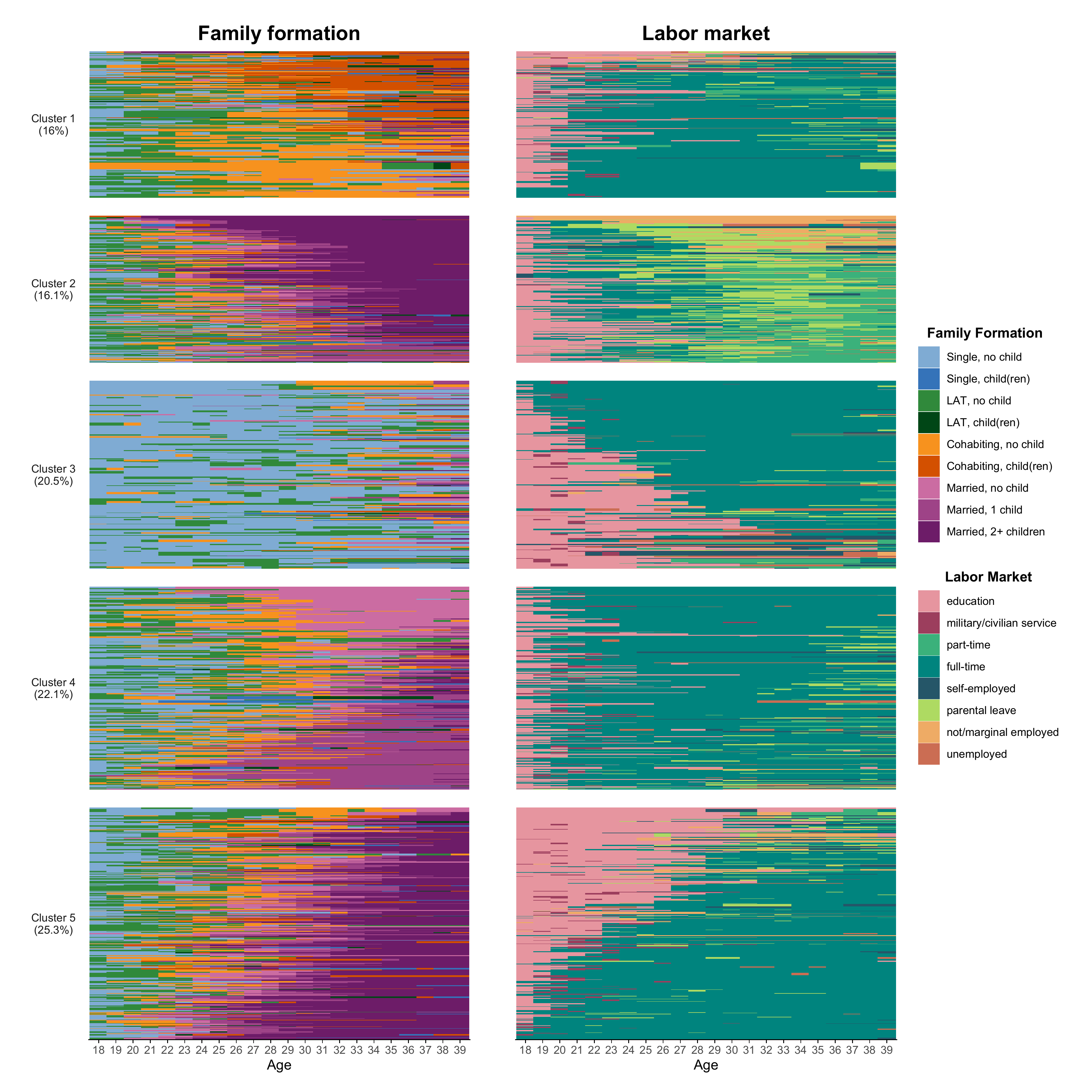
Composing the plot
Finally, we can start to rebuild Figure 5-2 from the book using
{ggseqplot}.
The height of the index plots reflects their prevalence in the
sample. This varying size is “enforced” by the use of the
force_panelsizes function of the wonderful {ggh4x} library.
In the code below, we first render the index plots for the family
trajectories and save them in the object p1. This will the
left panel of our final figure. The right panel, p2,
displays the labor market trajectories. Both panels are arranged in a
joint plot by the “composer of plots”, the {patchwork} library.
# The left panel: Family trajectories
p1 <- ggseqiplot(mc.fam.year.seq[cmd.idx,],
           group = multidim$mc.factor[cmd.idx],
           no.n = T, facet_ncol = 1, strip.position = "left") +
  scale_x_discrete(labels = 18:39, guide = guide_axis(check.overlap = TRUE)) +
  labs(title = "Family formation",
       x = "Age",
       y = NULL) +
  guides(fill = guide_legend(ncol = 1, title="Family Formation"),
         color = guide_legend(ncol = 1, title="Family Formation")) +
  force_panelsizes(rows = sort(unique(multidim$share))) +
  theme(strip.placement = "outside",
        strip.text.y.left = element_text(angle = 0))

# The right panel: Labor market trajectories
p2 <- ggseqiplot(mc.act.year.seq[cmd.idx,],
           group = multidim$mc.factor[cmd.idx],
           no.n = T, facet_ncol = 1, strip.position = "left") +
  scale_x_discrete(labels = 18:39, guide = guide_axis(check.overlap = TRUE)) +
  labs(title = "Labor market",
       x = "Age",
       y = NULL) +
  guides(fill = guide_legend(ncol = 1, title="Labor Market"),
         color = guide_legend(ncol = 1, title="Labor Market")) +
  force_panelsizes(rows = sort(unique(multidim$share))) +
  theme(strip.placement = "outside",
        strip.text.y.left = element_blank())


# Compose the final plot using {patchwork}
p1 + p2  +
  plot_layout(guides = 'collect') &
  theme(legend.position = "right",
        panel.spacing = unit(1, "lines"),
        axis.ticks.y = element_blank(),
        axis.text.y = element_blank(),
        legend.title = element_text(face = "bold"),
        plot.title = element_text(hjust = .5, size = 16, face = "bold"))