Click here to get instructions…
- Please download and unzip the replication files for Chapter 2 ( Chapter02.zip).
- Read
readme.htmland run2-0_ChapterSetup.R. This will create2-0_ChapterSetup.RDatain the sub folderdata/R. This file contains the data required to re-produce the results shown below. - We also recommend to load the libraries listed in the Chapter 2’s
LoadInstallPackages.R
# assuming you are working within .Rproj environment
library(here)

# install (if necessary) and load other required packages
source(here("source", "load_libraries.R"))

# load environment generated in "2-0_ChapterSetup.R"
load(here("data", "R", "2-0_ChapterSetup.RData"))
The figures in the book are printed in grayscale. Here we present the
colored versions of the figures. The zip archive with the replication
files for Chapter 2 contains both the code required to produce the
grayscale and the colored figures. Note that the code for the grayscale
plots rendered with seqplot is considerably longer than the
code for the colored figures because adding shading lines requires some
extra coding (see tutorial Color palette: Grayscale
Edition)
Different
sets of sequences,
same state distribution
Using two small example datasets each containing ten constructed partnership biographies, Figure 2.5 illustrates that the aggregation of different sets of sequences can yield identical aggregated state distributions.
The two example datasets are defined as:
# ===============================================
# Generating two example datasets; k = 5; n = 10
# ===============================================

ex1 <- tibble(state1 = c(1, 1, 1, 1, 1, 1, 1, 1, 1, 1),
              state2 = c(1, 1, 1, 1, 2, 2, 1, 1, 3, 3),
              state3 = c(1, 1, 3, 3, 3, 3, 2, 2, 4, 4),
              state4 = c(1, 1, 3, 3, 4, 4, 4, 4, 1, 1),
              state5 = c(1, 1, 4, 4, 4, 4, 2, 2, 3, 1))


ex2 <- tibble(state1 = c(1, 1, 1, 1, 1, 1, 1, 1, 1, 1),
              state2 = c(1, 1, 1, 1, 2, 2, 1, 1, 3, 3),
              state3 = c(1, 1, 4, 4, 2, 2, 3, 3, 3, 3),
              state4 = c(4, 4, 4, 4, 1, 1, 1, 1, 3, 3),
              state5 = c(4, 4, 4, 4, 2, 2, 1, 1, 1, 3))
In a next step the datasets are defined as sequence objects:
# Define long and short labels
shortlab.partner <- c("S", "LAT", "COH", "MAR")
longlab.partner <-  c("Single", "LAT", "Cohabiting", "Married")

# Definition of color palette using the colorspace package
colspace.partner <- sequential_hcl(4, palette = "Heat", rev = TRUE)


# Define sequence objects

partner.ex1.seq  <- seqdef(ex1, states = shortlab.partner,
                           labels = longlab.partner, alphabet = c(1:4),
                           cpal = colspace.partner)

partner.ex2.seq  <- seqdef(ex2, states = shortlab.partner,
                           labels = longlab.partner, alphabet = c(1:4),
                           cpal = colspace.partner)
This gives us the following two sets of sequences, which are plotted
as state distribution and index plots in the next step. Both sets can be
described by the same distribution plot, although they produce different
index plots. The equality of the two state distributions is demonstrated
with the all.equal function.
print(partner.ex1.seq, format = "SPS") Sequence
1 (S,5)
2 (S,5)
3 (S,2)-(COH,2)-(MAR,1)
4 (S,2)-(COH,2)-(MAR,1)
5 (S,1)-(LAT,1)-(COH,1)-(MAR,2)
6 (S,1)-(LAT,1)-(COH,1)-(MAR,2)
7 (S,2)-(LAT,1)-(MAR,1)-(LAT,1)
8 (S,2)-(LAT,1)-(MAR,1)-(LAT,1)
9 (S,1)-(COH,1)-(MAR,1)-(S,1)-(COH,1)
10 (S,1)-(COH,1)-(MAR,1)-(S,2) print(partner.ex2.seq, format = "SPS") Sequence
1 (S,3)-(MAR,2)
2 (S,3)-(MAR,2)
3 (S,2)-(MAR,3)
4 (S,2)-(MAR,3)
5 (S,1)-(LAT,2)-(S,1)-(LAT,1)
6 (S,1)-(LAT,2)-(S,1)-(LAT,1)
7 (S,2)-(COH,1)-(S,2)
8 (S,2)-(COH,1)-(S,2)
9 (S,1)-(COH,3)-(S,1)
10 (S,1)-(COH,4) all.equal(seqstatd(partner.ex1.seq), seqstatd(partner.ex2.seq))[1] TRUELike in Chapter 2.4.1 we use R’s layout function to arrange the plots of the figure.
layout.fig1 <- layout(matrix(c(1,2,3,4,4,4), 2, 3, byrow = TRUE),
                      heights = c(.75,.25), widths = c(.35, .325, .325))
layout.show(layout.fig1)
The plot consists of 4 elements:
- State distribution plot (
seqdplot): In the code below the plot is based onpartner.ex1.seqbut it would be the same if we had usedpartner.ex2.seqinstead. - Sequence index plot (
seqiplot) ofpartner.ex1.seq - Sequence index plot (
seqiplot) ofpartner.ex2.seq - Joint legend produced with
seqlegend
# ~~~~~~~~~~~~~~~~~~~~~~~~~~~~~~~~~~~~~~~~~~~~~~~~~
# Figure 2-5: Two Iplots, one Dplots (colored) ----
# ~~~~~~~~~~~~~~~~~~~~~~~~~~~~~~~~~~~~~~~~~~~~~~~~~

cairo_pdf(here("figures", "2-4-2_Fig2-5_dplot_iplots_color.pdf"),
          width=12,
          height=8)

layout.fig1 <- layout(matrix(c(1,2,3,4,4,4), 2, 3, byrow = TRUE),
                      heights = c(.75,.25), widths = c(.35, .325, .325))
layout.show(layout.fig1)

par(mar = c(1, 3, 3, 2), las = 1)
seqdplot(partner.ex1.seq, ylab = "Relative frequency",
         with.legend = "FALSE", border = NA,  axes = FALSE)
title(main = "State Distribution Plot", cex.main = 2, line = 1.35)
axis(1, at=c(.5:4.5), labels = c(1:5))

par(mar = c(0, 2, 2, 2), mgp = c(3, 1, -.97))
seqiplot(partner.ex1.seq, sortv = seqfpos(partner.ex1.seq,"MAR"),
         with.legend = "FALSE", yaxis = FALSE, axes = FALSE,
         main = "Sequence Index Plot I", cex.main = 2)
axis(1, at=c(.5:4.5), labels = c(1:5))
seqiplot(partner.ex2.seq, sortv = seqfpos(partner.ex2.seq,"MAR"),
         with.legend = "FALSE", yaxis = FALSE, axes = FALSE,
         main = "Sequence Index Plot II", cex.main = 2)
axis(1, at=c(.5:4.5), labels = c(1:5))

par(mar = c(0, 2, 0, 2))
seqlegend(partner.ex1.seq, cex = 1.5, position = "center", ncol = 4)

dev.off()

pdf_convert(here("figures", "2-4-2_Fig2-5_dplot_iplots_color.pdf"),
            format = "png", dpi = 300, pages = 1, antialias = TRUE,
            here("figures", "2-4-2_Fig2-5_dplot_iplots_color.png"))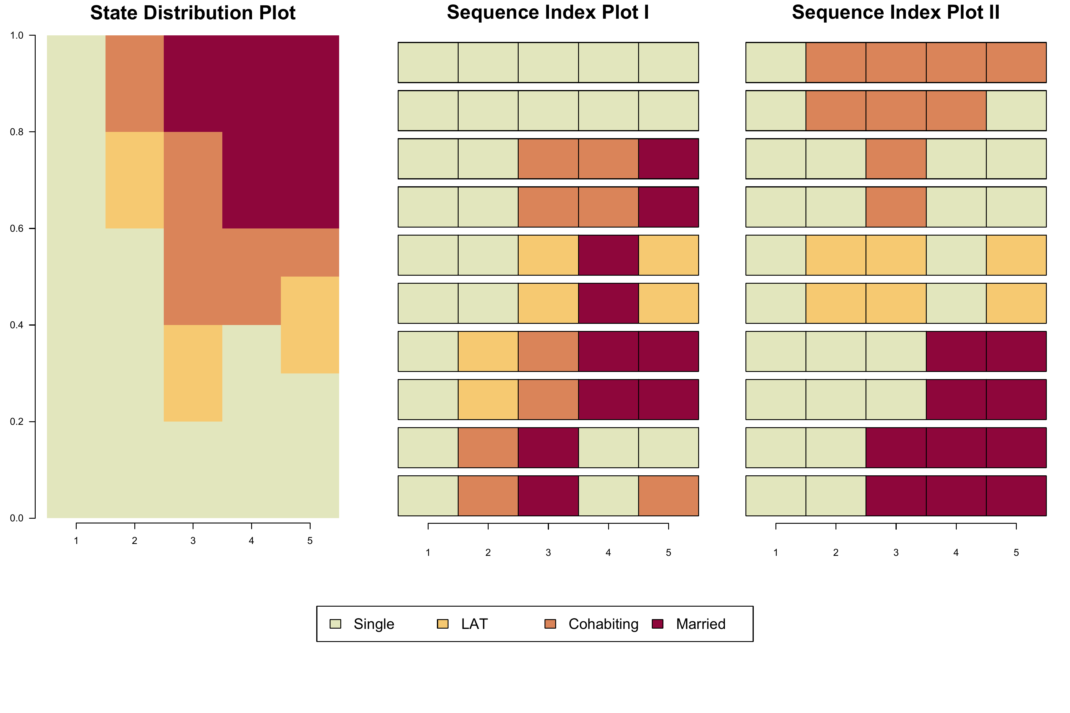
The relative frequency index plot
This section illustrates how to render relative frequency index plot
using the standard seqIplot function instead of {TraMineRExtras}’s
seqplot.rf. Although seqplot.rf produces an
appealing result, the function lacks flexibility. For instance, it does
not allow to adjust specific aspects of its two sub-plots (e.g., axis
labels and titles) and it is not suited for producing grayscale figures
that use shading lines to differentiate between states.
Accordingly, we generated a tweaked version of
seqplot.rf which does not render the graph but stores the
information required to generate the desired visualization
manually. This information is saved in a list object and the
different elements of this list will be used to render the plot.
Here you can download the tweaked version of
seqplot.rf:
Generating a relative frequency index plot requires the sequences to
be sorted according to a substantively meaningful principle. By default
seqplot.rf (and relfreqseq-obj.R) sorts the
sequences according to their score on the first factor derived by
applying multidimensional scaling on a matrix of pairwise
dissimilarities between sequences. This matrix has to be computed prior
to the call of the seqplot.rf function. The following
command is generating such a matrix using Optimal Matching with the
default cost specification (indel = 1, substitution = 2) on our family
formation sequence data (yearly granularity). For further details on
dissimilarity measures see tutorials for Chapter 3.
partner.child.year.om <- seqdist(partner.child.year.seq,
                                 method="OM", sm= "CONSTANT")
Once the dissimilarity matrix is generated, the information required
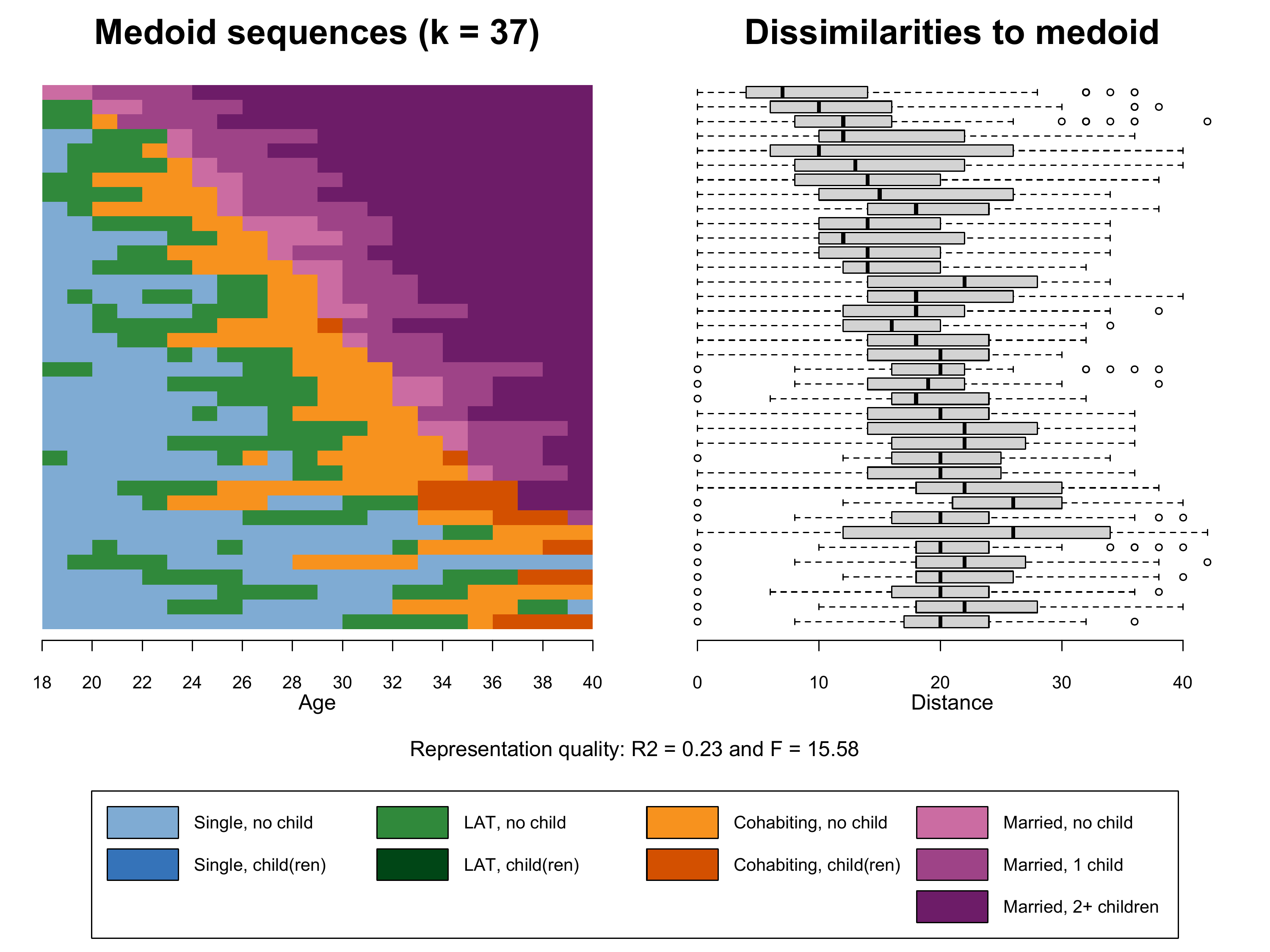
for the plots can be extracted and saved as a list object by the new
relfreqseq-obj function. The example data comprise 1866
sequences and we extract 37 frequency groups each containing \(1866/37 = 50\) sequences.
# adjusted version of seqplot.rf saving objects required for plotting
source(here("source", "relfreqseq-obj.R"))

# Extract representative sequences for 37 frequency groups
k37.mds <- relfreqseq.obj(partner.child.year.seq,
                          diss=partner.child.year.om,
                          k=37)
Based on this object we finally can produce Figure 2.6. Note that we
use the legend_large_box function instead of the the
default legend function and rearrange the elements shown in
the legend to obtain a more appealing result.
Details on setting up the legend
We start generating our plot by fine-tuning the appearance of the legend (for a detailed account of the procedure see here). We add “blank” entries (no label, white boxes) to ensure that each of the columns in the legend corresponds to a distinct partnership state (Single, LAT, Cohabitation, Marriage).
# ...adding empty labels below Single, LAT, and Cohabitation
longlab.partner.child2 <- append(longlab.partner.child, "", after=2)
longlab.partner.child2 <- append(longlab.partner.child2, "", after=5)
longlab.partner.child2 <- append(longlab.partner.child2, "", after=8)

# ...adding white cells below Single, LAT, and Cohabitation
colspace.partner.child2 <- append(colspace.partner.child,"#FFFFFF",after=2)
colspace.partner.child2 <- append(colspace.partner.child2,"#FFFFFF",after=5)
colspace.partner.child2 <- append(colspace.partner.child2,"#FFFFFF",after=8)

# ...defining border colors for the boxes in legend:
#       regular color = black
#       color for empty cells = white
bordercol.partner.child <- c(rep(c("black","black","White"),3),
                             rep("black", 3))


# source a tweaked version of the legend function
source(here("source", "legend_large_box.R"))


# Produce a test version of the legend (empty plot with legend)
plot(NULL ,xaxt='n',yaxt='n',bty='n',ylab='',xlab='', xlim=0:1, ylim=0:1)

legend_large_box("center", legend = longlab.partner.child2,
                 ncol=4, fill=colspace.partner.child2,
                 border = bordercol.partner.child,
                 box.cex=c(4.5,1.5),  y.intersp=2,
                 inset=c(0,-.4), xpd=TRUE)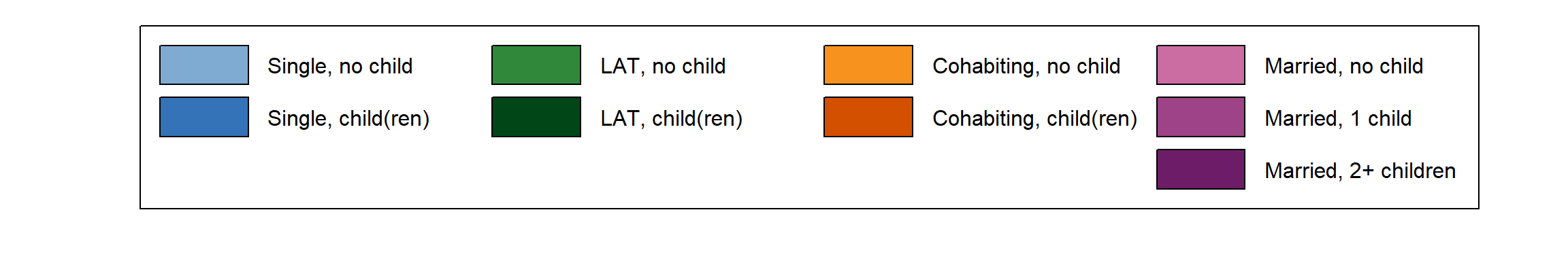
Like for the previous plot we use the layout function to
arrange the three elements of Figure 2.6.
- The index plot of the representative sequences
(
seqIplot) stored in the first element of the listk37.mds - Boxplot of within frequency group distances to medoid
(
boxplot) based on the second and third element of the listk37.mds - The legend depicting colors and labels of the alphabet
Note that we also extract the information on the representation
quality (\(R^2\) and \(F\)) from k37.mds (elements 7
and 8). (Tip for R novices: You can refer to the elements of a list
either by referring to their list position or their name,
e.g. k37.mds[["R2"]] == k37.mds[[7]]. The names can be
obtained by names(k37.mds))
cairo_pdf(here("figures", "2-4-3_Fig2-6_relfreqIplot_mds_color.pdf"),
          width=10,
          height=7.5)

layout.fig1 <- layout(matrix(c(1,2,3,3), 2, 2, byrow = TRUE),
                      heights = c(.75,.25))
layout.show(layout.fig1)

par(mar=c(3, 2, 3, 2))
seqIplot(k37.mds[[1]],
         with.legend=FALSE,
         axes = FALSE,
         yaxis = FALSE, ylab = NA,
         main="Medoid sequences (k = 37)", cex.main = 2,
         sortv=k37.mds[[2]])

par(mgp=c(3,1,-0.5)) # adjust parameters for x-axis
axis(1, at=(seq(0,22, by = 2)), labels = seq(18,40, by = 2))
mtext(text = "Age",
      side = 1,#side 1 = bottom
      line = 2)

par(mar=c(3, 2, 3, 2),
    mgp=c(3,1,-0.5)) # adjust parameters for x-axis
boxplot(k37.mds[[3]]~k37.mds[[2]],
        horizontal=TRUE,
        width=k37.mds[[4]],
        frame=FALSE,
        main="Dissimilarities to medoid", cex.main = 2,
        at=k37.mds[[6]],
        yaxt='n', ylab = NA, xlab = NA)
mtext(text = "Distance",
      side = 1,#side 1 = bottom
      line = 2)

par(mar=c(1, 1, 4, 1))
plot(NULL ,xaxt='n',yaxt='n',bty='n',ylab='',xlab='', xlim=0:1, ylim=0:1)

legend_large_box("center", legend = longlab.partner.child2,
                 ncol=4, fill=colspace.partner.child2,
                 border = bordercol.partner.child,
                 box.cex=c(4.5,1.5),  y.intersp=2,
                 inset=c(0,-.4), xpd=TRUE)

title(main = paste("Representation quality: R2 =",
                   round(as.numeric(k37.mds["R2"]),2),
                   "and F =", round(as.numeric(k37.mds["Fstat"]),2)),
      line = 2, font.main = 1)

dev.off()

pdf_convert(here("figures", "2-4-3_Fig2-6_relfreqIplot_mds_color.pdf"),
            format = "png", dpi = 300, pages = 1, antialias = TRUE,
            here("figures", "2-4-3_Fig2-6_relfreqIplot_mds_color.png"))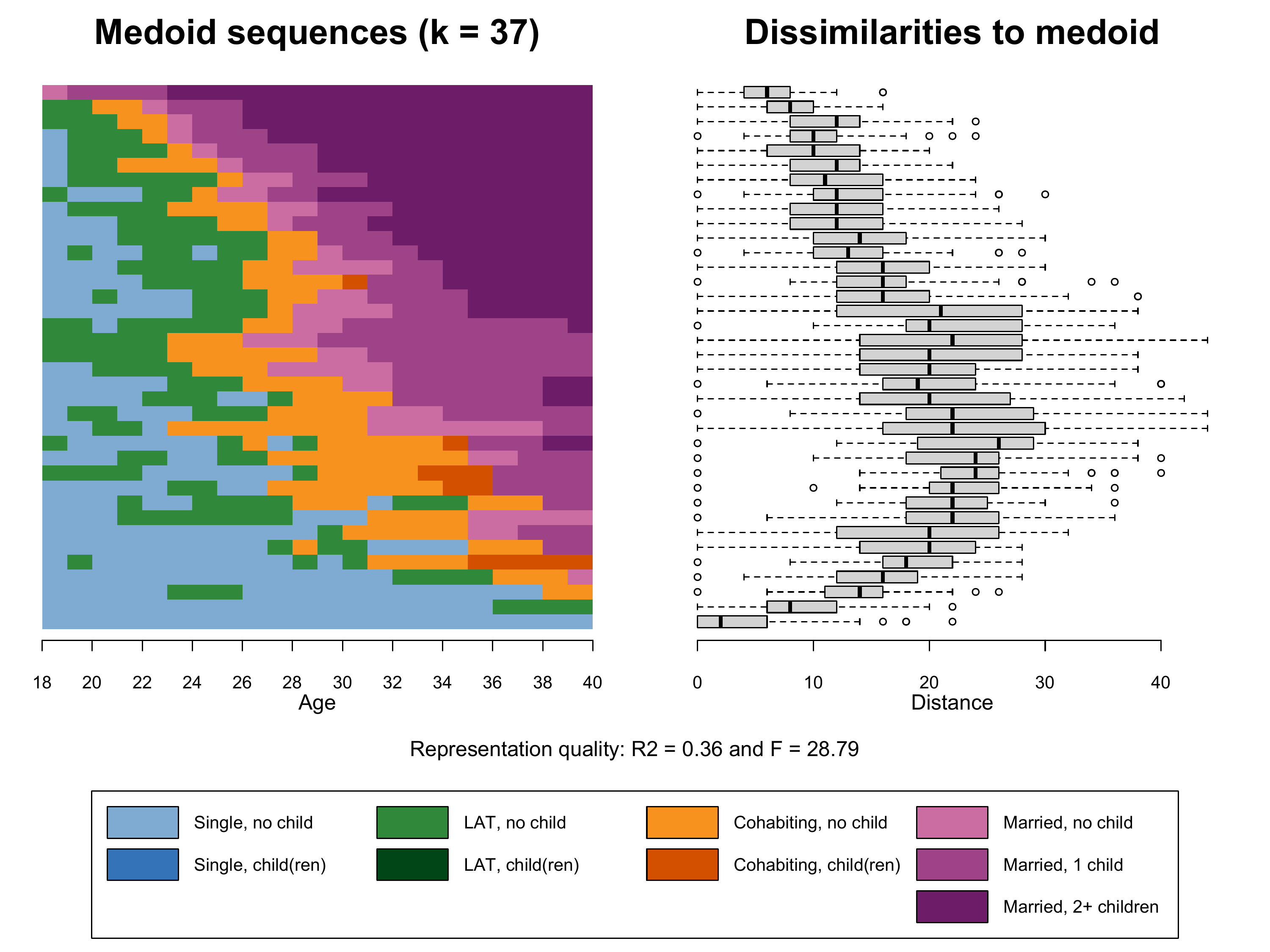
Bonus
material:
Additional relative frequency sequence plots
The quality and the appearance of relative frequency sequence plots heavily depend on the underlying analytical choices. Below we illustrate how the plot looks like with
- more frequency groups (k=100) or
- a different sorting criterion (time spent in marriage). The marital
states are the last three states of the alphabet
(
alphabet(partner.child.year.seq)[7:9]), the respective state frequencies are extracted with{TraMineR}’sseqistatdfunction, and summed up usingrowSums.
The plots are generated in excactly the same way as above. We only
have to replace k37.mds with k100.mds (+ the
number of the frequency groups in the left plot title) and
k37.mardur respectively.
k100.mds <- relfreqseq.obj(partner.child.year.seq,
                          diss=partner.child.year.om,
                          k=100)

k37.mardur <- relfreqseq.obj(partner.child.year.seq,
                             diss=partner.child.year.om,
                             sortv = rowSums(seqistatd(partner.child.year.seq)[,7:9]),
                             k=37)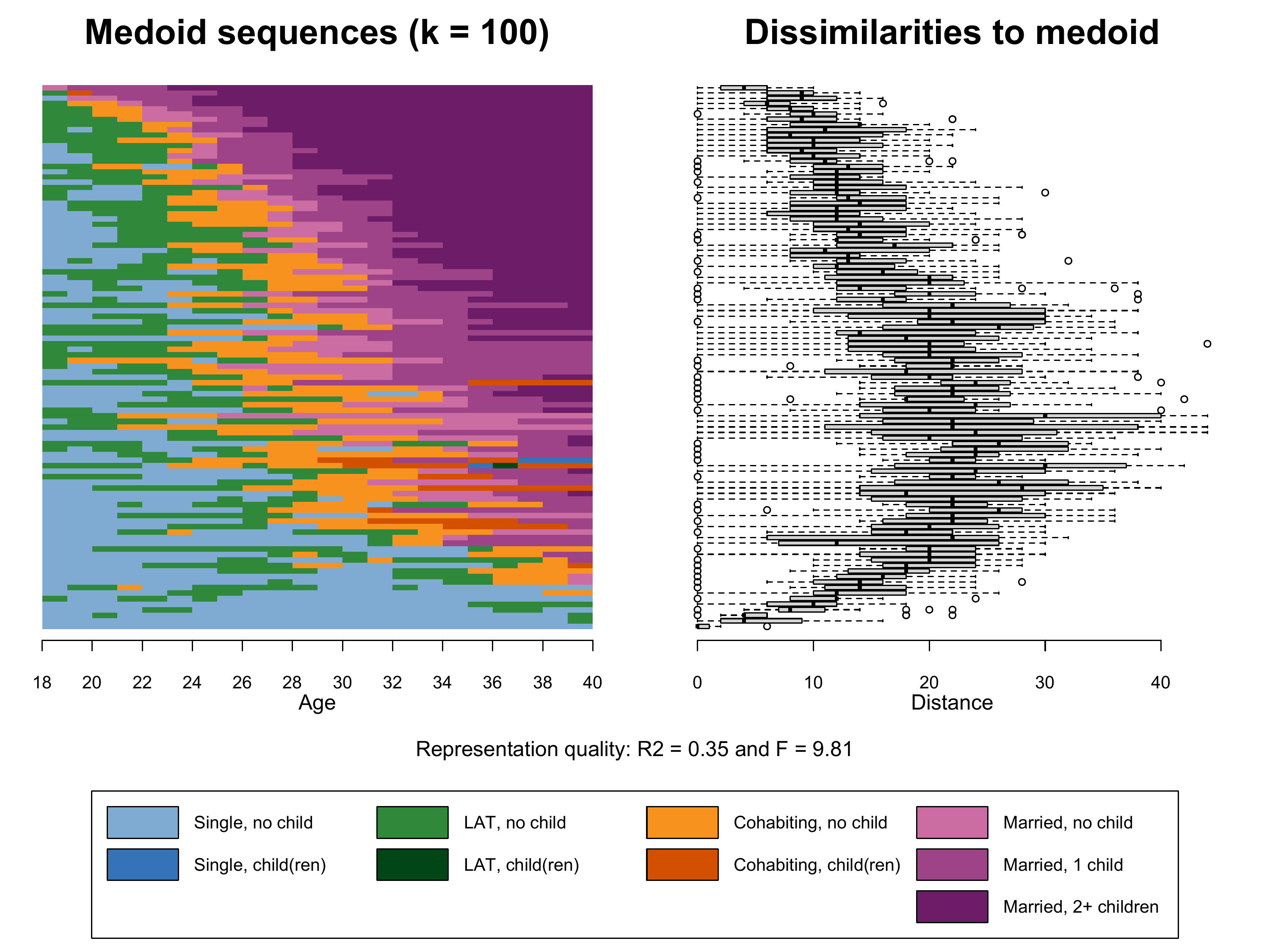
Compared to the plot shown in the book (k37.mds) the
addition of 63 additional frquency groups (k100.mds) leads
to a slightly more nuanced index plot. The medoids, however, are not
performing better in representing the sequences within their frequency
groups (see \(R^2\)).
Regarding k37.mardur the dissimilarities to medoid plot
and the lower \(R^2\) show that the
alternative sorting criterion performs worse than the MDS-based solution
with the same number of frequency groups (k37.mds).
In the next figure we re-plot only the two medoid sequences of the
two \(k=37\) solutions to ease the
comparison. In terms of code this requires to replace the
box-whisker-plot from the previous code snippet
(boxplot(k37.mds[[3]]~k37.mds[[2]] ...) by another
seqIplot. In addition, we slightly adjust the two index
plots’ titles to print the two \(R^2\)
values.
cairo_pdf(here("figures", "2-4-3_Fig2-6_bonus_relfreqIplot_mds_vs_mardur_color.pdf"),
          width=10,
          height=7.5)


layout.fig1 <- layout(matrix(c(1,2,3,3), 2, 2, byrow = TRUE),
                      heights = c(.75,.25))
layout.show(layout.fig1)


par(mar=c(3, 2, 3, 2))
seqIplot(k37.mds[[1]],
         with.legend=FALSE,
         axes = FALSE,
         yaxis = FALSE, ylab = NA,
         main= paste("Medoids sorted by MDS factor; R2 =",
                     round(as.numeric(k37.mds["R2"]),2)),
         cex.main = 1.4,
         sortv=k37.mds[[2]])

par(mgp=c(3,1,-0.5)) # adjust parameters for x-axis
axis(1, at=(seq(0,22, by = 2)), labels = seq(18,40, by = 2))
mtext(text = "Age",
      side = 1,#side 1 = bottom
      line = 2)

par(mar=c(3, 2, 3, 2))
seqIplot(k37.mardur[[1]],
         with.legend=FALSE,
         axes = FALSE,
         yaxis = FALSE, ylab = NA,
         main= paste("Medoids sorted by marriage duration; R2 =",
                     round(as.numeric(k37.mardur["R2"]),2)),
         cex.main = 1.4,
         sortv=k37.mardur[[2]])

par(mgp=c(3,1,-0.5)) # adjust parameters for x-axis
axis(1, at=(seq(0,22, by = 2)), labels = seq(18,40, by = 2))
mtext(text = "Age",
      side = 1,#side 1 = bottom
      line = 2)

par(mar=c(1, 1, 1, 1))
plot(NULL ,xaxt='n',yaxt='n',bty='n',ylab='',xlab='', xlim=0:1, ylim=0:1)

legend_large_box("center", legend = longlab.partner.child2,
                 ncol=4, fill=colspace.partner.child2,
                 border = bordercol.partner.child,
                 box.cex=c(4.5,1.5),  y.intersp=2,
                 inset=c(0,-.4), xpd=TRUE)

dev.off()


pdf_convert(here("figures", "2-4-3_Fig2-6_bonus_relfreqIplot_mds_vs_mardur_color.pdf"),
            format = "png", dpi = 300, pages = 1, antialias = TRUE,
            here("figures", "2-4-3_Fig2-6_bonus_relfreqIplot_mds_vs_mardur_color.png"))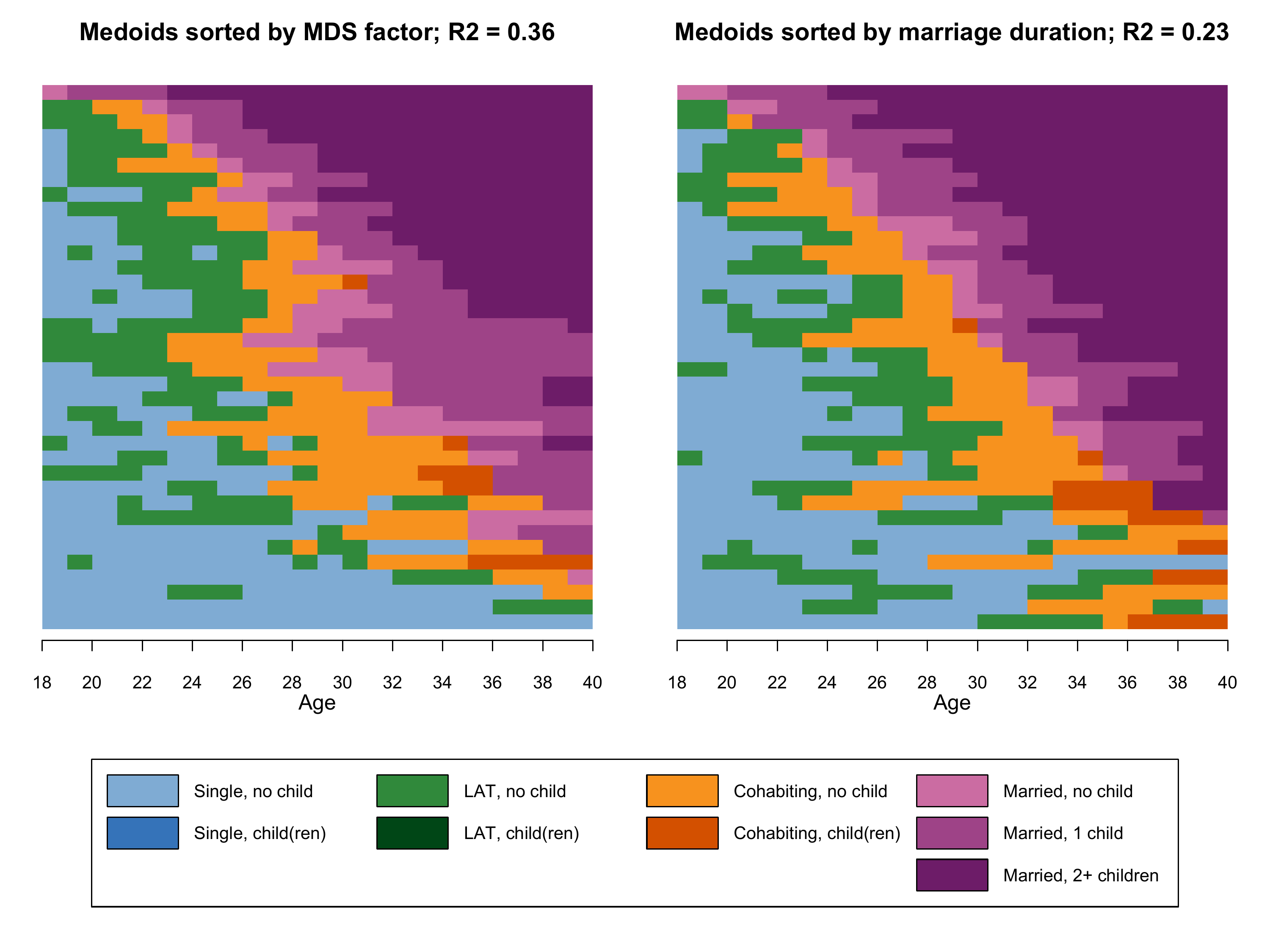
While the two plots clearly resemble each other, they also show some marked differences. The medoids in the right panel are much more dominated by the state “Married 2+ children”. Note that both plots still represent the same data. The sorting criterion just led to a different selection of medoids and consequently to different visual representations of the same data.
Ultimately, relative frequency sequence plots are a data reduction strategy whose results depend on the input parameters. Luckily, the \(R^2\) and \(F\) values allow to evaluate and to compare the quality of different solutions.
It is also worthwile to inspect how the state distributions at different positions of the sequence compare to those shown in the state distribution plot (which presents a summary of the entire data set as opposed to a selection of representative sequences). Based on these criteria we prefer the sorting based on multidimensional scaling for generating relative frequency sequence plots with our example data.
In general, we recommend to test different specifications of the sorting criteria, the dissimilarity measure, and the number of chosen frequency groups. In the example shown in our book, for instance, we used a rather low number of frequency groups in order to ensure readibilty of the grayscale figures. The results, however, were robust to changes in the number of frequency groups.